Enter password
My Role
Timeline
3 months
Team
Product Manager
Project Manager
Designers: 3
Tools
Figma
Miro
User-Centric Design
Atoms are the base elements: color, typography, icons, buttons, form fields. Getting them right is what makes everything above them coherent.
COLORS
The palette is built as a semantic elevation and role system, not a raw swatch list.
Colors are labeled by the job they do: background elevations, CTA hierarchy, text states, legal copy.
#120806
Elevations 2 - Cards, Auction Sheets
#33231F
Elevations 3 - Toasts, Notifications
#483D3D
#120806
#FFC400
TYPOGRAPHY
A fluid Roboto scale that adapts size and line height to the viewport, keeping text legible and consistent from the largest title down to body copy across every device.
Roboto Font
Style
Title 1
Title 2
Title 3
Headline
Body
Preview
Moving our world
Moving our world
Moving our world
SemiBold
Regular
GRIDS & SPACING
375X812
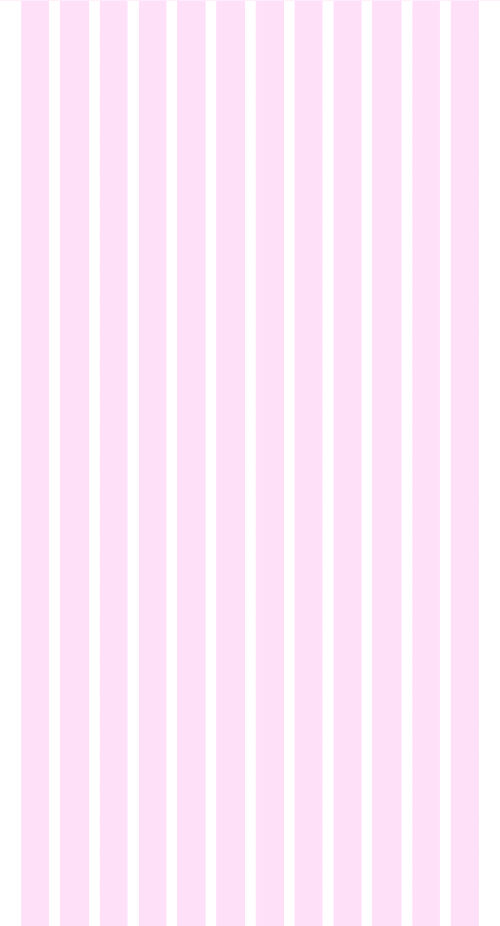
360X760

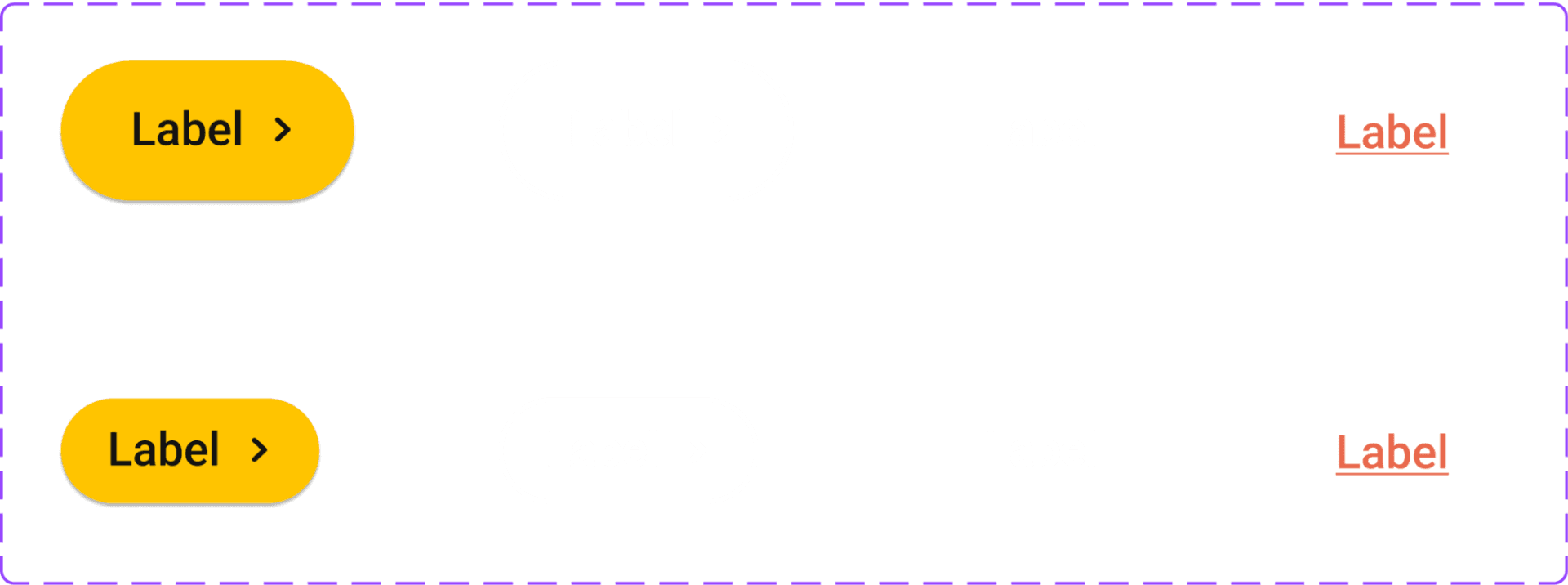
Buttons & Labels

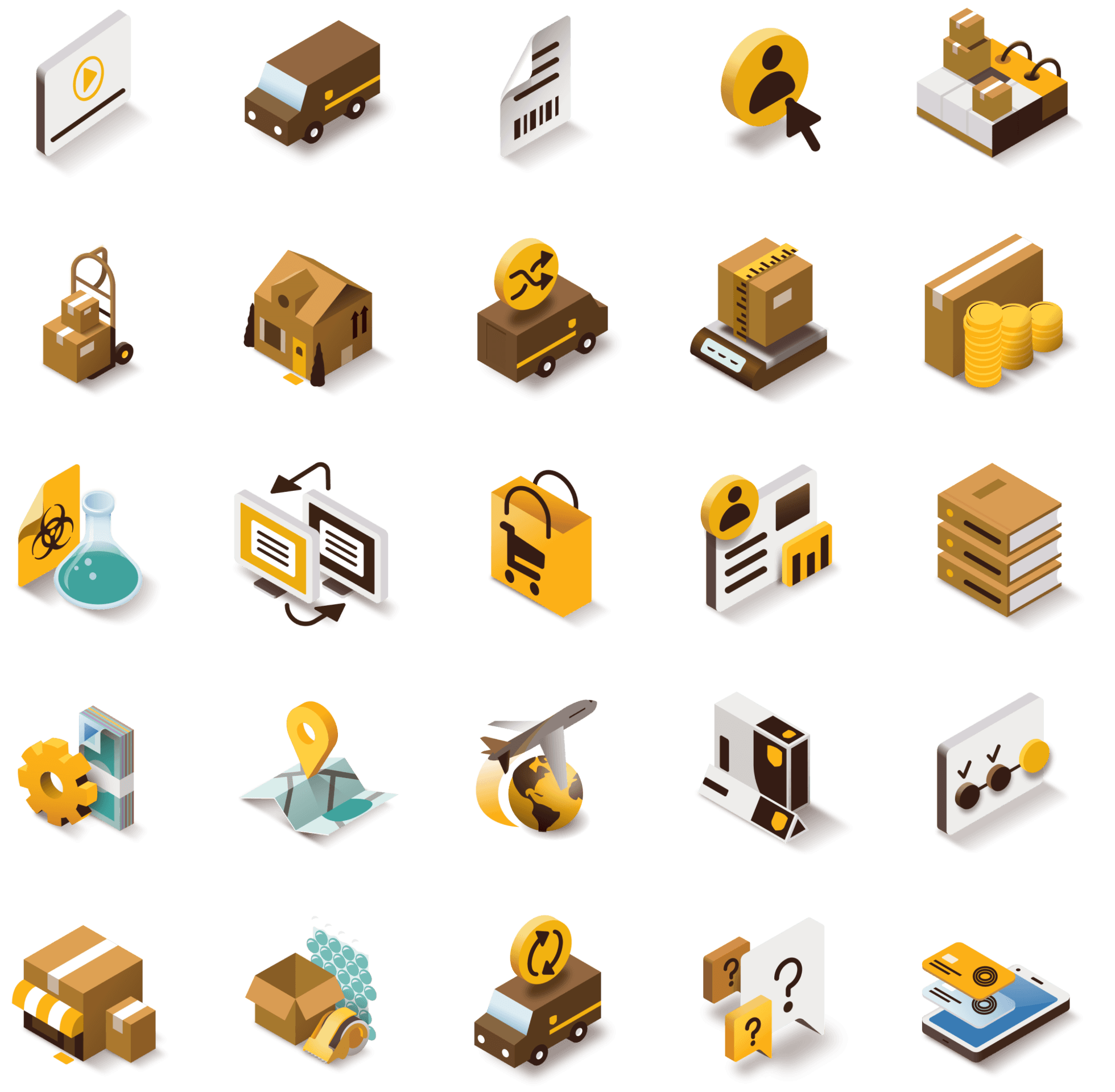
ICONS

ILLUSTRATIONS
Two or more atoms combined into a single functional unit: form elements, navigation, cards, the chat bot interface. Each is a reusable pattern with its states and behavior defined once, then used everywhere.
Form Elements

Navigation

Cards
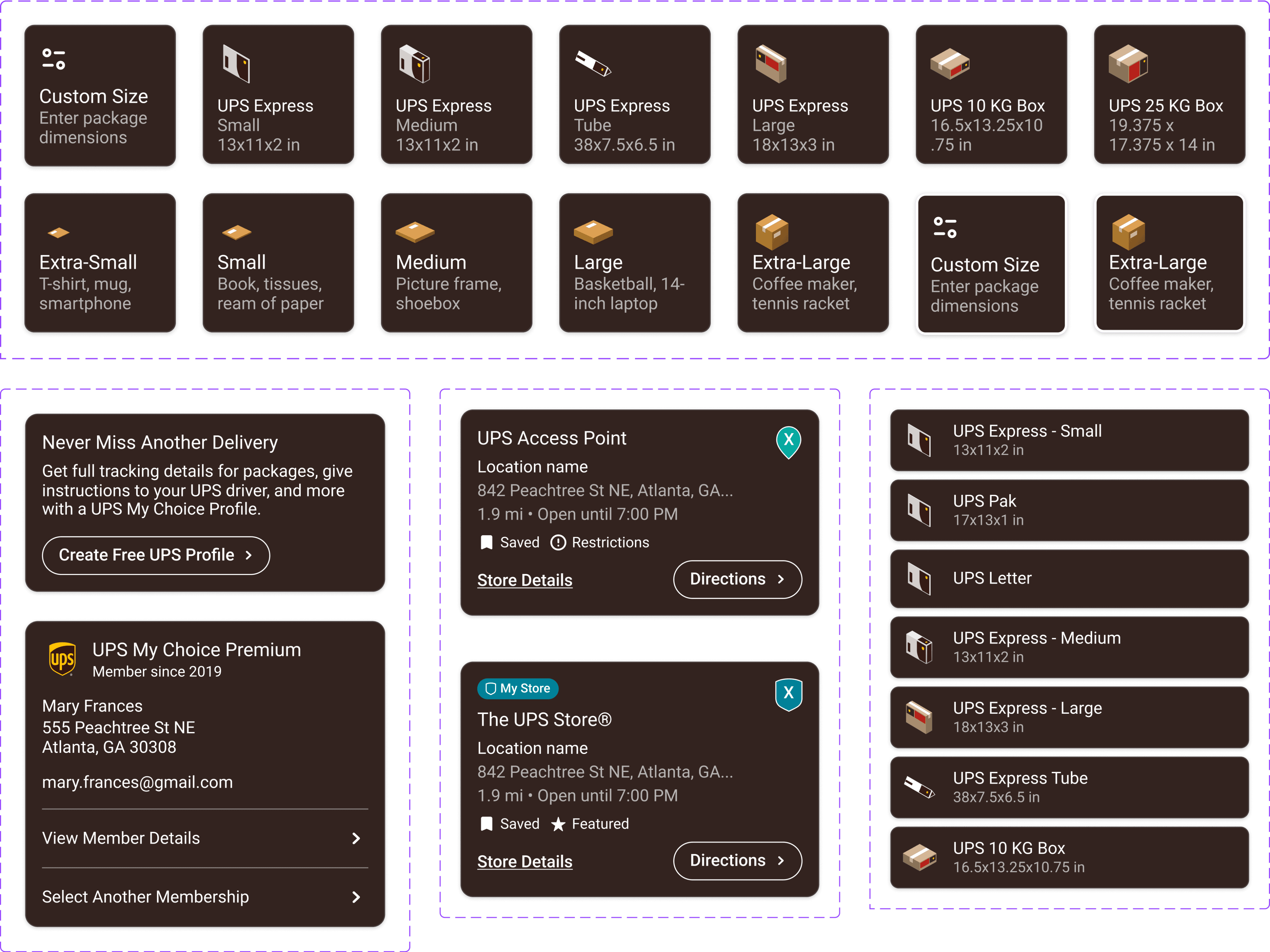
Chat Bot

Molecules assembled into complete, distinct sections of the interface — widgets and balance sheets — the larger building blocks teams compose screens from without reinventing structure each time.
WIDGETS

Balance Sheets
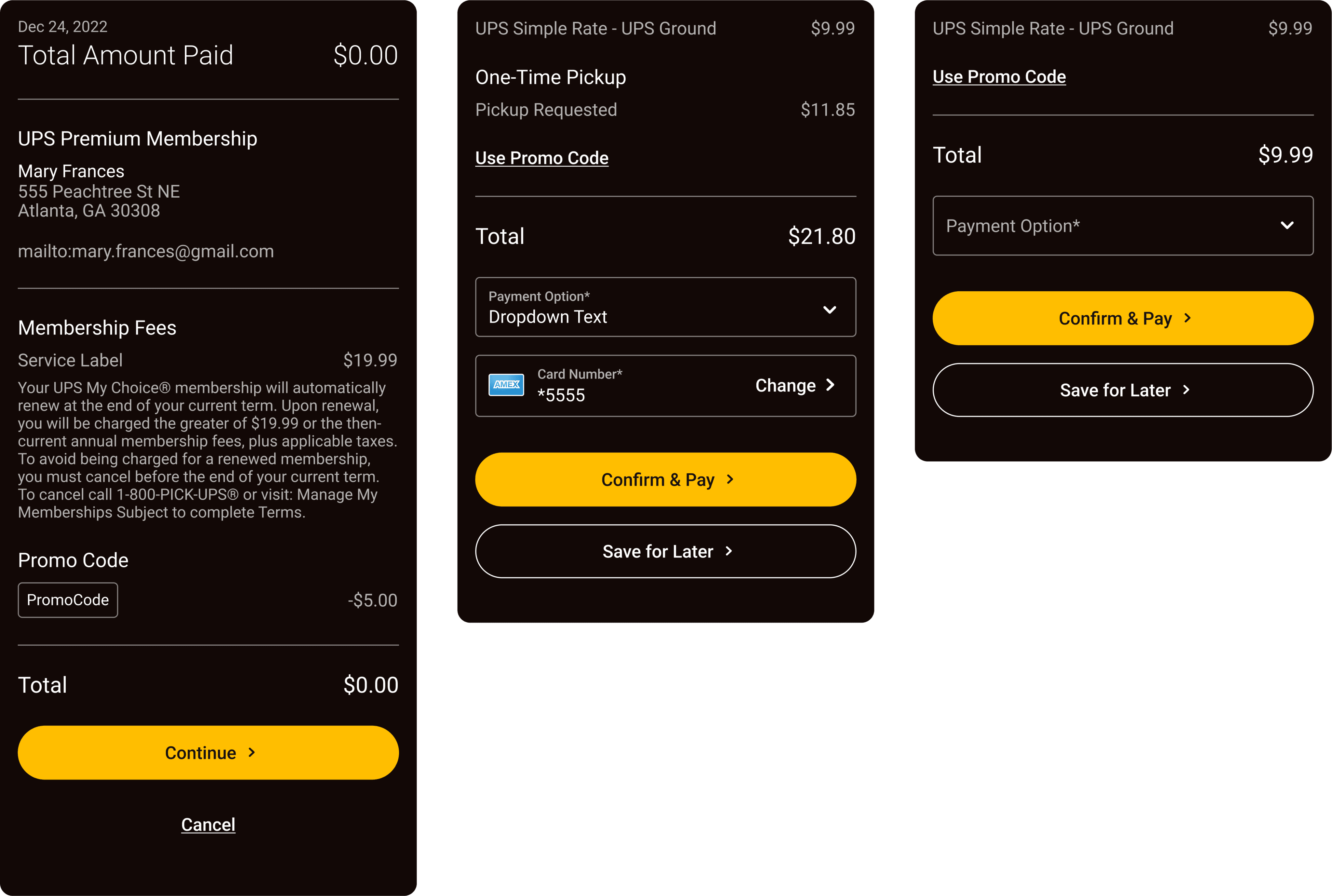
Where the system pays off: design → engineering
Because every component mapped 1:1 to code, engineers stopped rebuilding UI per project and started composing screens from a shared library. Design handoff went from interpretation to assembly.
A system built for engineering, not just for designers to reference is what turned the library from a style guide into infrastructure.
Reflection